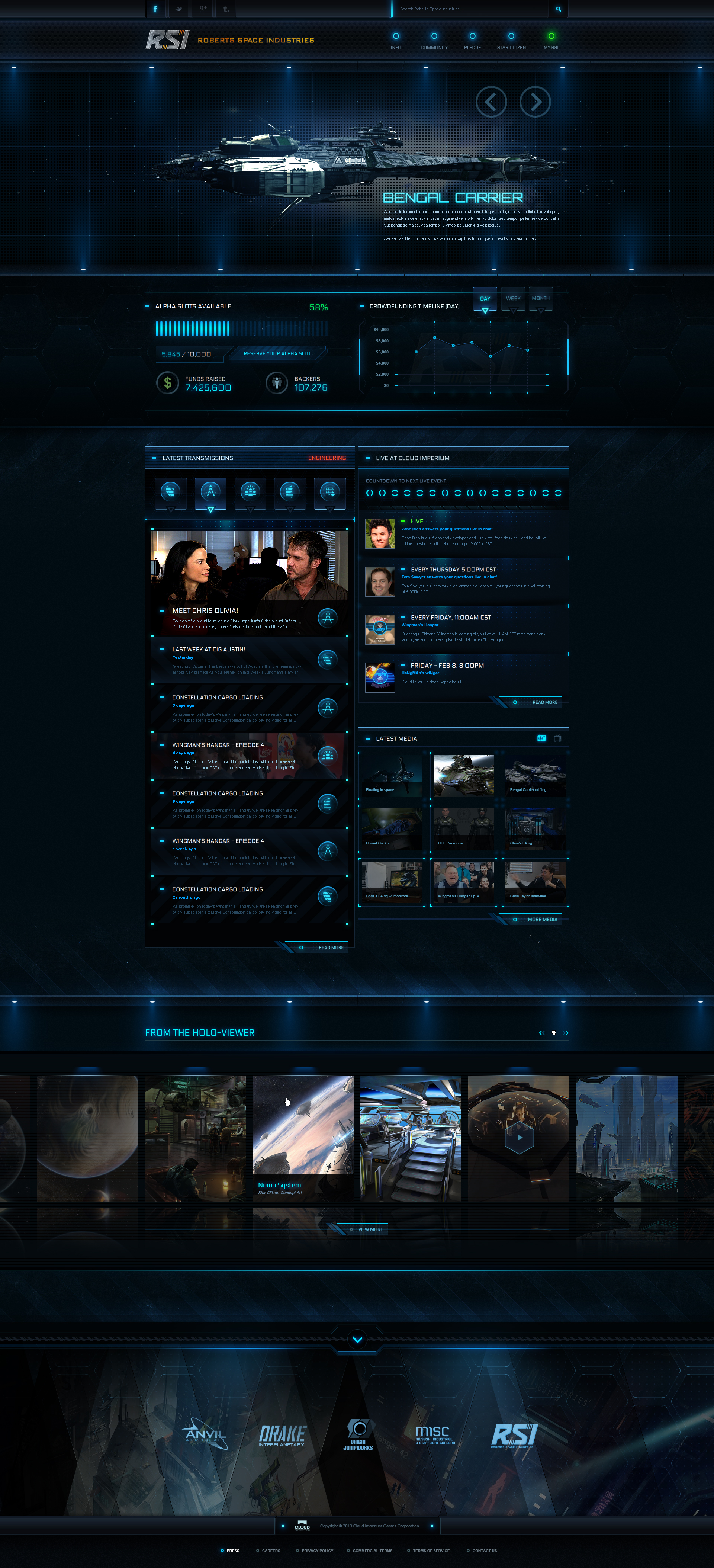
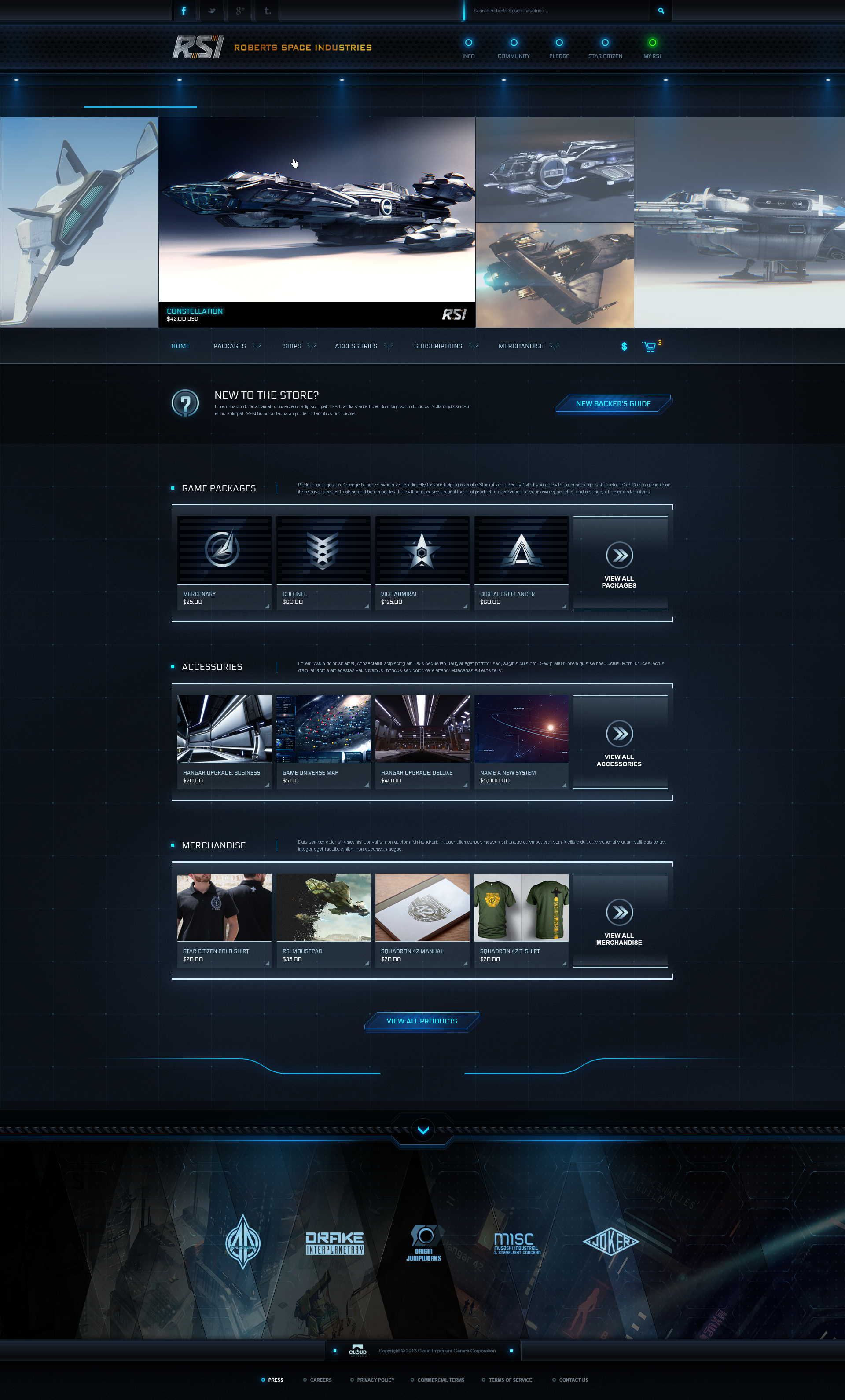
One of my first major tasks starting out at CIG was to completely overhaul the design and visual aesthetic of the entire website. The visual language developed for the website would eventually go on to inform the look of the UI and menus in the actual game itself.
In terms of the visual aesthetic, my goal was to have visitors start to become immersed into the fiction of the Star Citizen universe as well as reflect the time period in which the lore takes place (the future, +930 years). This was accomplished by incorporating detailed graphical elements which gave the sense of being tangible 3D objects on the webpage, along with unique button styles and animations.

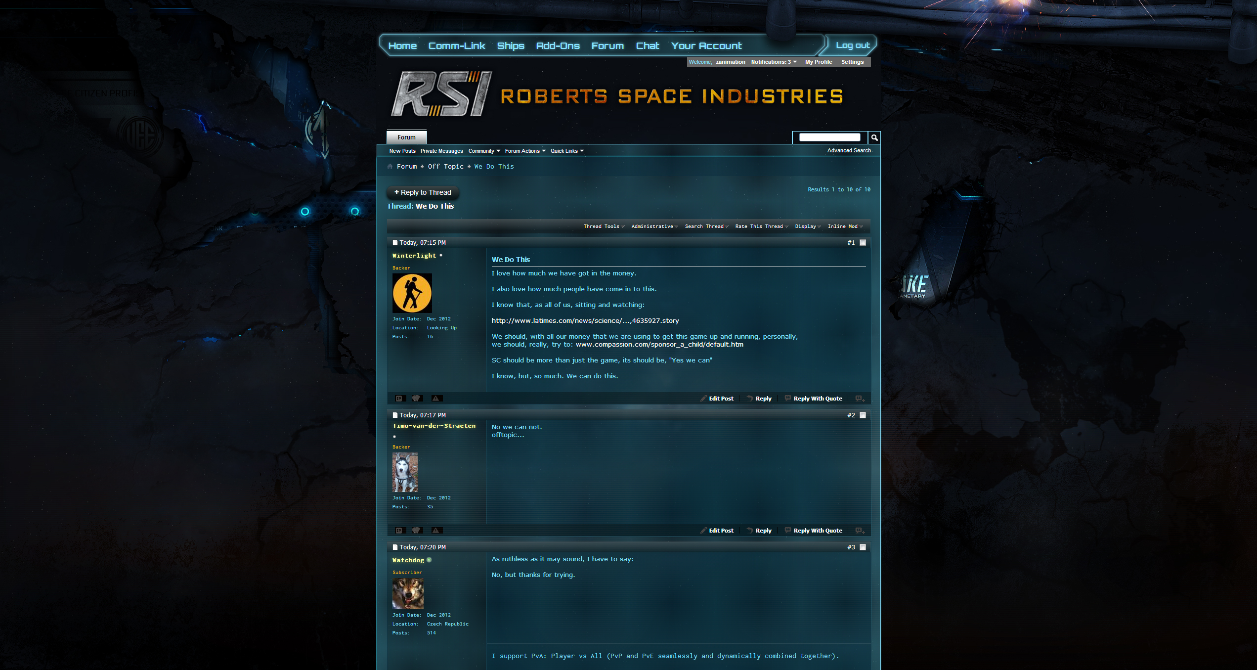
Each user has a public dossier (profile) page. The design of this was made to look like an official paper record originating in the lore's time period.


As the website receives a heavy amount of traffic daily, a switchover to a complete website redesign was going to be quite a big deal.
Having been inspired by what 2Advanced Studios did in their transition from v4 to v5 of their website back in the late 2000s, I wanted to do something similar and put forth the idea of doing a kind of gradual buildup to the transition event, starting with subtle visual cues then gradually increasing the severity of visual degradation over the course of a few weeks leading up to the eventual switchover.
The fun in this being that no explanation was provided, and that it was left up to the users to interpret the significance of the cracks and weird underpinnings that suddenly started showing up on the website. As the degredation intensified, the meaning of it became more apparent and that it was hinting at an imminent switch to the new website.
What follows are the various website background images that were designed to reflect the ever increasing degradation 'phases'.